Skip to primary navigation
Skip to main content
Skip to primary sidebar
Mes 2 livres
Podcast
À propos – About Me
Dans les médias
Pinterest
Say Hi!
Instagram
Damask & Dentelle
Le design vu à travers le prisme de l'histoire
Architecture
Boutiques déco
Conseils déco
Design.HER
Décorer selon les saisons
Printemps
Été
Automne
Hiver
Événements
Intérieurs
Home Tours
Bulles de cerveau
Ma maison
Français
Tendances
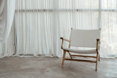
Le rideau, retour d’une architecture souple
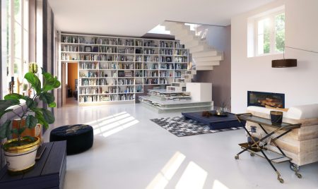
Bookshelf wealth : quand l’étagère devient le nouveau récit de soi
Le minimalisme heureux selon Cœur d’Artichaut
Tendance: Le bleu ciel, couleur thérapie du printemps 2026
100 ans de styles déco
7 Tendances déco à adopter en 2023
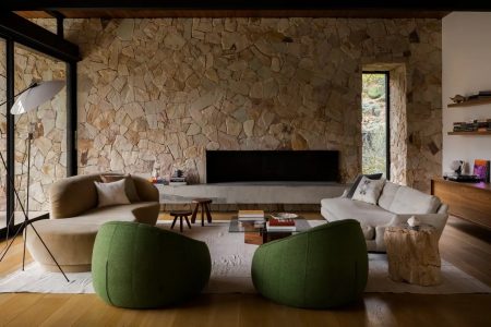
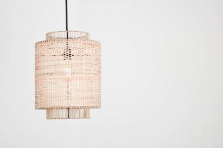
Tendance: L’osier
Trend Watch: 6 Trends We Love This Fall
Couleur tendance: vert sauge
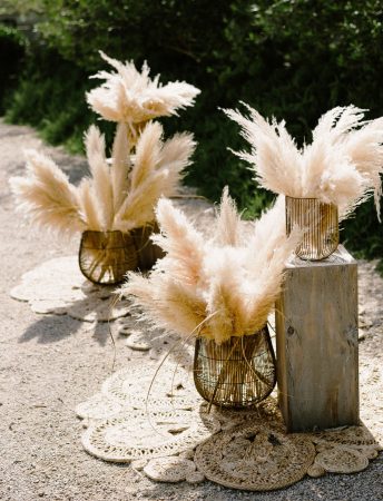
Trending: Move Over Eucalyptus Here Comes the Pampas Grass
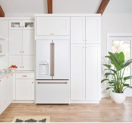
Les électros Café, c’est hot hot hot
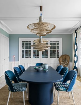
Trending: Blues and Greens
Page
1
Page
2
Page
3
Go to
Next Page »
7ads6x98y